An always-on application where you can watch, search & discover all of your favourite free to air TV shows on your Smart connected TV, smartphone or tablet.
Overview
Freeview Australia were seeking to upgrade their Hybrid Broadband TV service for Smart TVs with an “Always on” mini tv guide along with a brand refresh. This project consisted of a discovery and research phase, then designing and stake holder approvals. Freeview Australia also wanted to continue upgrading their service with a second phase looking at an upgrade to the search and discovery of Australian TV content.
Goal
Two long term goals:
– Review, redesign, validate and enhance their TV experience
– Expand and enhance their Android and iOS mobile and tablet apps.
Role
Senior Product Designer
User Research, Prototyping, User Flows, UI Design, Developer Handoff
Tools
Figma, Lookback, JIRA
Team
2 Researchers
1 Designer
3+ Engineers
1 BA and numerous Stakeholders
Timeline
16 weeks
(two 8 week phases)

Exploring, Listening, Validating and Innovating the TV browsing and watching experience of Australian TV
1
Phase 1: TV
A new Onboarding flow for the TV experience. This is a little glimpse on the Onboarding improvements I worked on.
Understanding the TV browsing and watching habits of everyday Australians.
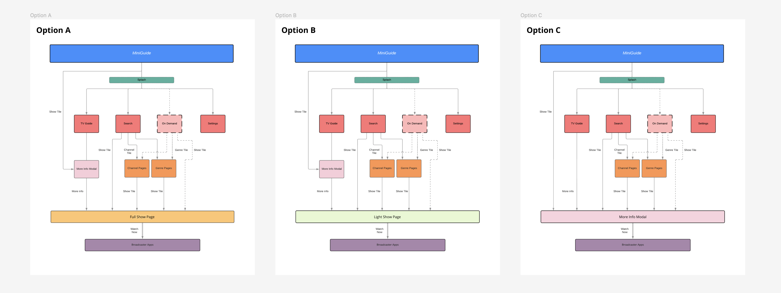
Freeview Australia were seeking to upgrade their Hybrid Broadband TV service for Smart TVs with an “Always on” mini tv guide along with a brand refresh. This initial phase consisted of a discovery and research, then designing and stake holder approvals. Development was handed over to another party with documentation and handoff notes.

A full TV experience redesign backed by user research
I worked closely with my design manager and co-lead the research for Freeview. A questionnaire survey followed by qualitative research which consisted of comparative usability testing on initial wireframes. This data guided the decisions of the new experience which I designed flows and high fidelity designs. Along each step of the way I had to present reports, progress and designs to the Product Working Group, a set of stakeholders representing ABC, SBS, 7 Network, 9 Network and 10 Network.

Challenges continuing through COVID
This first phase of the project resided in the middle of the COVID-19 pandemic in 2020. The challenges of work-from-home combined with qualitative user-research with interviews meant I had to learn new skills to conduct research remotely and online. There were many tech hurdles to overcome, but I was able to guide and assist multiple test participants that were 60+ years old to connect to video call interviews.
Designs, Approvals, Builds and Launch
The data driven approach gave us the insights to produce high fidelity designs and flows. This was all approved by the Product Working Group. The next part of the project was to handover to the engineering team to build the app.
I was brought back in to assess the design quality of the builds and give the “go ahead” from a UX perspective. This phase of the product launched in April 2021.
10
Participant in Qualitative User Research
12+
Recommendations for future updates
20%
Increase of usage of Freeview’s TV Platform


2
Phase 2: apps
Understanding the TV browsing habits of everyday Australians and their use of mobile companion apps.
Overview
Freeview Australia sought to continue upgrading their service with an upgrade to the search and discovery of Australian TV content. This overall lead to the prioritising of the new mobile companion app along with a brand refresh. This project took insights and learning from the earlier phases of the project while completing a new discovery and research phase, followed by high-fidelity designs and hand-off to the engineering team.

User research lead redesign of a new ‘search and discovery’ experience
I lead the research and discovery phase with a small design team for the research stage for “search and discovery” of TV and movie content. Similar to the first phase of the Freeview project, a questionnaire survey followed by qualitative research on initial wireframes shaped the recommendations and steps taken to redesign the new experience. Freeview’s decisions lead to prioritising the mobile app redesign over the TV experience, the rest of the project was then focused on the new mobile app. I lead the high fidelity Android and iOS mobile and tablet designs with a junior designer assisting throughout the project. This allowed for some great opportunities for mentoring and knowledge sharing.


Biggest Challenge
This project had a very comfortable well structured discovery and research phase which produced some high-level wireframes. The next phase of high fidelity design along with development and quality assurance saw some unexpected tech hurdles and dependancies put time pressure on the both the design and development side of the project. I was able to trim out some of the fat and reuse generic components to between Android and iOS platforms to be able to deliver the project on time.


3
Reflection
This project was a great one as we delivered two phases and were able to return to features initially explored and then build upon them.
The challenges of COVID lockdowns and remote working was an initially hurdle but managed to flourish with the use of online collaboration tools. Other challenges involved pleasing and aligning a 6 party working group which all parties needed to align and agree.
The research sections of this project were my highlights, being able to dive deep with users and really understand their pain points and their usage habits. While we explored many of these, unfortunately we were not able to address some of the larger pain points due to the equal and fair structure that Freeview holds among the TV networks.
Read through more case studies on my portfolio


